Thrive Helmet Co.
Designed a streamlined e-commerce site and branding to launch a new sustainable skateboard helmet
TEAM
3 UX Designers
MY ROLE
• UI design and e-commerce section
• Animation and motion graphics
• Branding
• Partnered on UX research, user testing
The Challenge
OVERVIEW
Thrive Helmet Co is a new online retail company aimed at helping skateboarding athletes and enthusiasts protect their heads from the inside and out. It sells helmets sustainably made from recycled plastics and also provides exclusive content to build one’s mental strength and foster a strong sense of community. Thrive is open to all skateboarders regardless of gender, race, or age.
CLIENT GOALS
The client needed the following deliverables:
- User Research & Information Architecture
- Prototype of Website
- Logo & Branding
After initial discussions and learning more about the brand they envisioned, we learned there were additional goals and needs they hoped to promote through the website.
We reflected on all this information and created an affinity map of everything, unveiling 3 core pillars: e-commerce, community, and mental strength. We would rely on these pillars throughout our process and return to them frequently.

Research Discovery
THE RESEARCH
Before we could begin, we needed to understand more about the skateboarding audience and target customer. We conducted surveys of 7 seasoned skateboarders between the ages of 19-35, asking them a series of questions about:
- their experience with skateboarding
- how they got into it
- why they stayed with it
- their goals and interests
- purchasing behaviors
- personal experience with helmets and safety
- community
- mental strength
This was provided invaluable information. We learned the audience was driven, curious, and creative.

HELMETS AND SAFETY
When it comes to helmets, safety and purchasing decisions, we learned the following:
- 71% do NOT regularly wear a helmet (for a variety of reasons, most notably due to comfort and not being cool)
- The most important factor in purchasing decisions is style/color/trends, even over price, sustainability, safety, quality. Reviews and celebrity endorsements are not a factor at all.

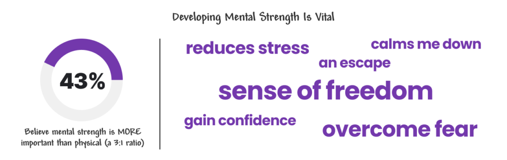
MENTAL STRENGTH IS VITAL
When it comes to mental strength, we discovered a strong correlation between mental and physical strength to be successful in skateboarding. All of those surveyed believed mental strength was at least EQUALLY important as physical strength, with 43% saying mental strength was actually MORE IMPORTANT (a 3:1 ratio).
We also learned about the motivations and benefits that skateboarding provides: a mental escape, reduces stress, calms them down, provides a sense of freedom, and helps them overcome fear and gain confidence—not just in skating but in life.
COMMUNITY IS EVERYTHING
When it comes to community, some respondents said it’s like family. They HIGHLY VALUE their community, wanting a local community where they can:
- plan meet ups
- make solid friendships
- learn from and support each other
THE PROBLEM
With this information, we were able to define the problem statement as: Skateboarders need a single online space where they can not only shop for products, but gain knowledge and feel supported by members of their skating community, because skateboarding takes a lot of mental strength.
THE PERSONA
We developed a customer persona based on this research, which helped us focus on finding solutions for his needs. He doesn’t always wear a helmet, but knows he should and:
- Wants a sustainable helmet that’s comfortable and cool
- Wants a simple way to find resources on improving mentally and physically
- Needs an easy way to find skaters in his area

COMPETITIVE ANALYSIS
To better understand the marketplace and competitive environment to see where Thrive fit in and where it could stand out, we conducted a competitive and comparative analysis of 4 direct competitors (e-commerce sites that sell helmets as listed by the client), 4 general skateboarding sites, and 5 sporty retailers.

For each company, we analyzed and reviewed the following aspects:
- Our core pillar of e-commerce (specifically in regards to sustainability)
- Our core pillar of mental strength
- Our core pillar of community
- Unique features
- Diversity and inclusion (something our client highly valued)
With this additional information about the skateboarding market, we were able to zero in our solution and begin the design phase.
Design Exploration
BRANDING
After we had a clear sense of our target audience through our surveys and a better understanding of the marketplace through our competitive and comparative analysis, we began developing the branding.
I led the development of mood boards based on our research that we believed were effective solutions to the problem. We presented them to the client, and they selected their favorite (which was also our favorite).

THE LOGO
The client shared some initial sketches based on the idea of merging a 3 and 5 to phonetically say “thrive,” but also symbolically speak to the duality of the brand and its goal to protect your head from the inside and out.
We iterated further on this concept and presented the client with 5 options. They chose one that had a mix of a gothic typeface they initially had in mind but also included elements of 3D graffiti. This was our top pick as well.

We created an extended brand style guide that explains the logo and its uses, typography selection, color palette, design elements, and imagery approach. We then used this to build out our website prototype.
INFORMATION HIERARCHY
While this is an e-commerce site at it’s core, it still needed to house additional content that users could easily find.
We conducted card sorting on 5 testers and successfully funneled the content into 3 channels that echo our 3 brand pillars:
- SHOP = e-commerce pillar
- CONNECT = community pillar
- EXPLORE = mental strength and education resources pillar

SKETCHING AND WIREFRAMING
As we began sketching and wireframing, we aimed to keep the e-commerce site at the forefront of our designs and the user experience.
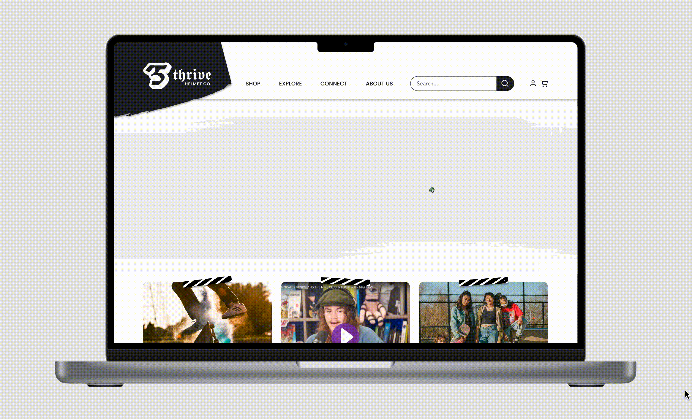
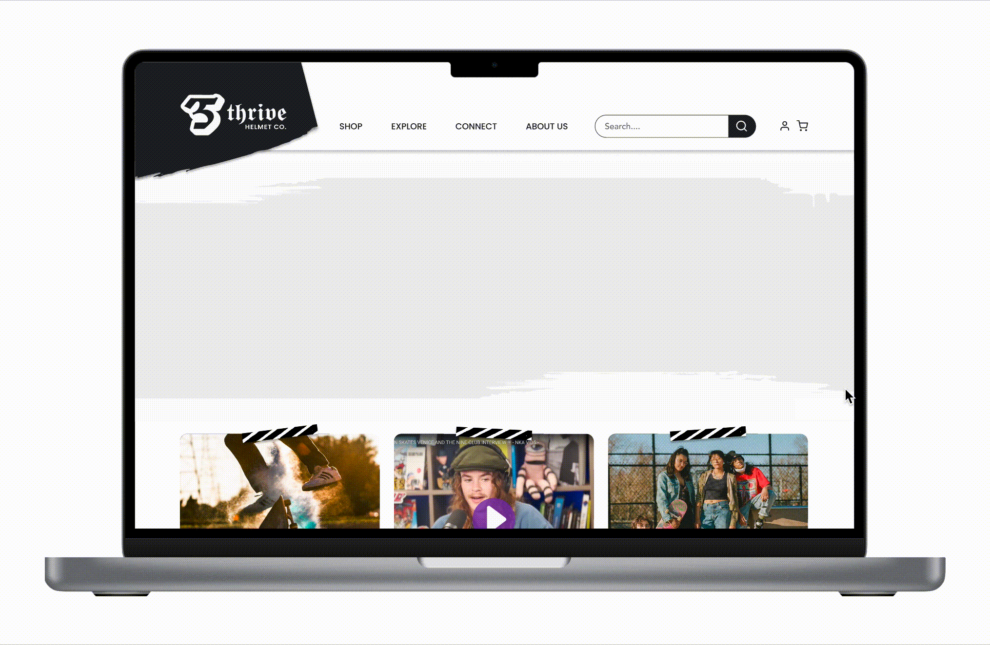
Homepage Hero
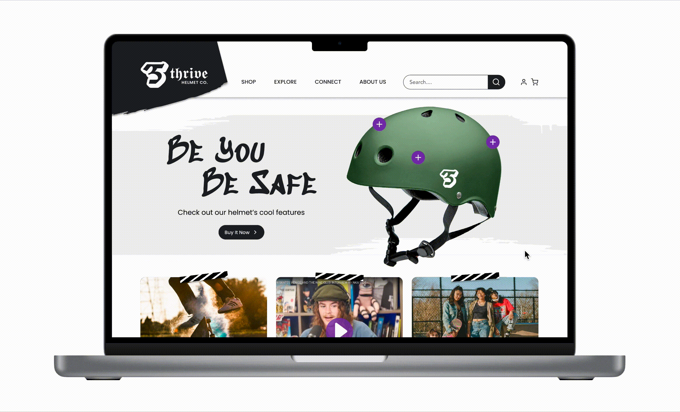
To promote the helmet and its features of sustainability and safety, we made that the focus of the homepage. Here’s an example of one of my sketches we used to create the final desktop and mobile homepage screens.

Custom Tagline and Animation
We also created the tagline “Be You. Be Safe.” to speak to the audience’s value of individuality and uniqueness, while further driving home the message of helmet safety.
I animated it to further add emphasis to the content, and also made it an interactive element for users to engage with and learn more about the helmet’s features.
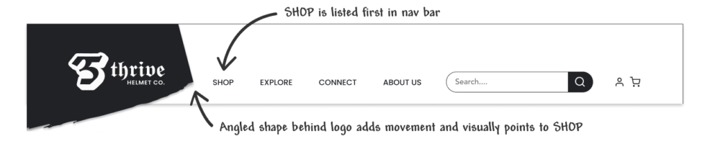
Primary Navigation
Since selling the helmet was the site’s primary objective, we listed SHOP first in the primary navigation to make it clear to users this is an e-commerce site. We also angled the shape behind the logo to subtly point to SHOP.
USER FLOWS
To ensure a streamlined flow through the e-commerce section, we also created a user flow.

KEY FEATURES
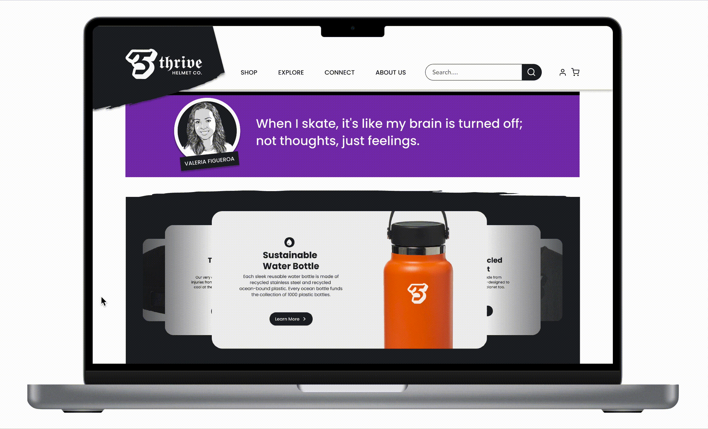
Homepage Product Carousel
We created a homepage carousel to easily promote other products on the site and indicate to users that this is an e-commerce site.
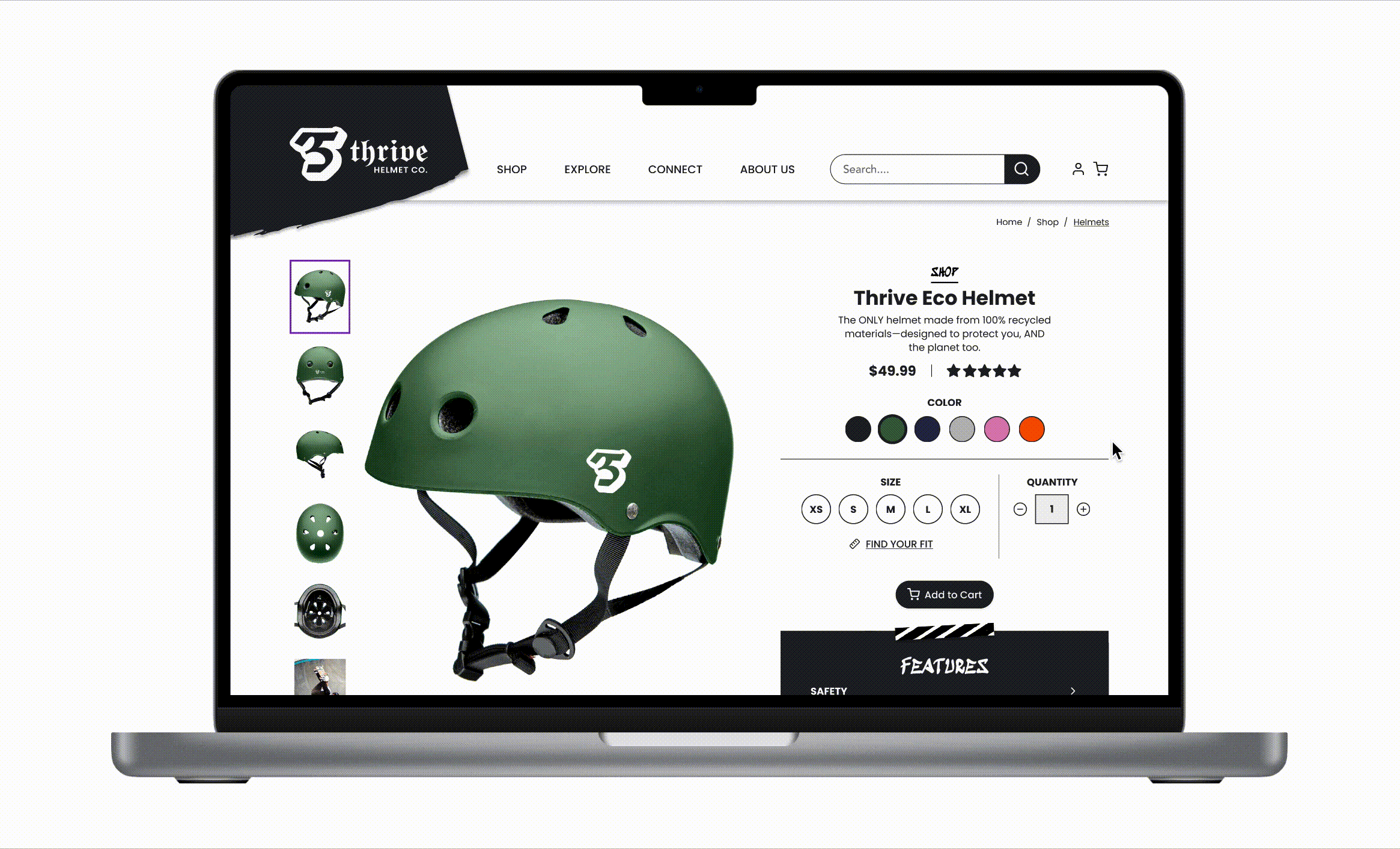
Interactive Color Picker
For the product pages, we kept the layout simple and clean with large product images, but also wanted to increase engagement with an interactive color picker. Below are a few sketches I made to show how we could keep the focus on large product images but still include a color picker, description text, pricing, and a save-to-wishlist icon.
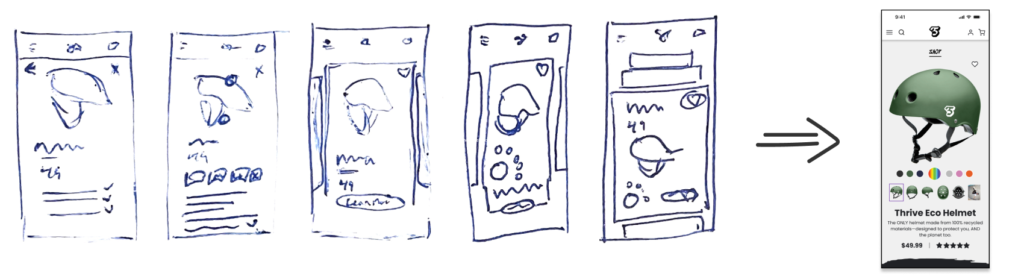
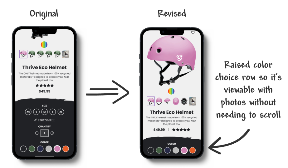
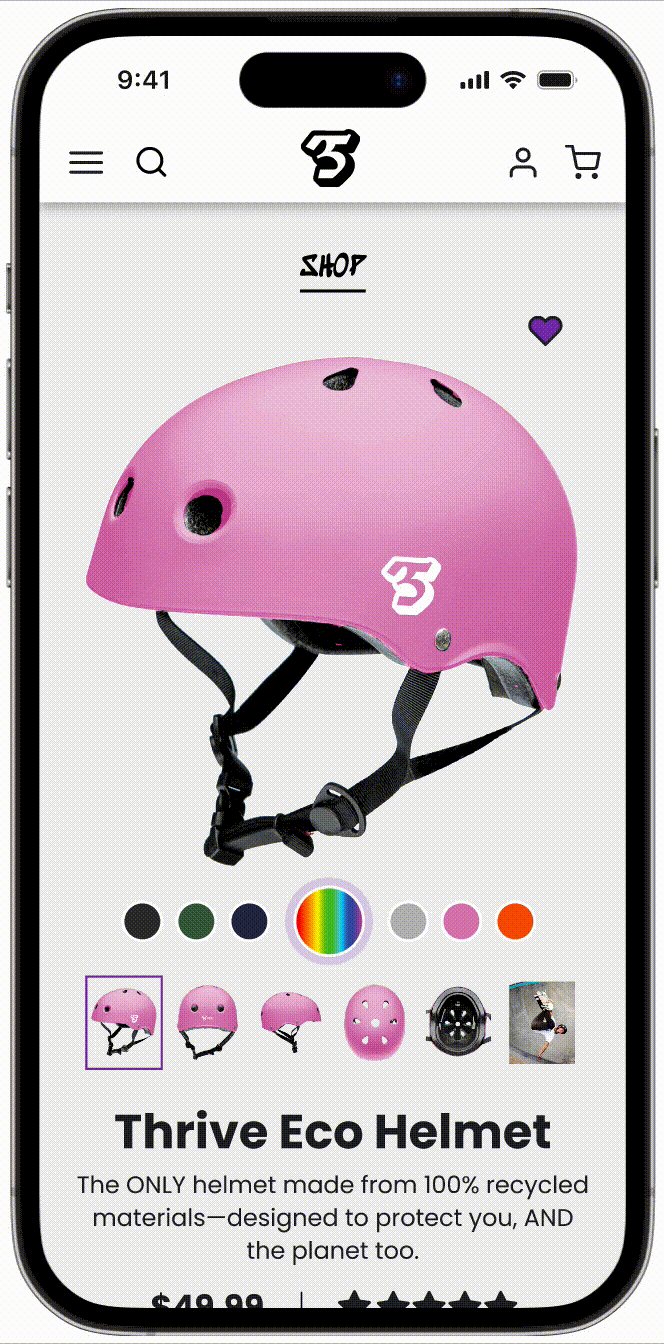
For Mobile: The unique, interactive color picker allows mobile users to quickly change a product’s color without needing to scroll at all. It also had some “fun” and engagement to the page.
For Desktop: Given the larger space to work with, we didn’t need the interactive color picker. Instead we designed these pages with the row of color options next to the large product photos, all within the same screen view, creating a smooth user experience.


Content Card Designs
To ensure a strong user experience with the mental strength content, we presented 4 designs of content cards to 11 testers to understand their preferences when it came to image size, additional text like subheads, icon placement, and additional information like the time taken to read or view videos.

45% of our users preferred option #2 with the addition to add the ability to bookmark. We were then able to implement this format into our prototype before testing.
User Testing and Results
USER TESTING AND FIXES
We conducted user testing on 16 users for our mobile mid-fidelity wireframe and 8 users for our desktop hi-fidelity wireframe.
Branding and Visual Aesthetic
For our desktop hi-fi testing, we asked users to look at the homepage and let us know how they would describe the site’s aesthetics and content. They said:
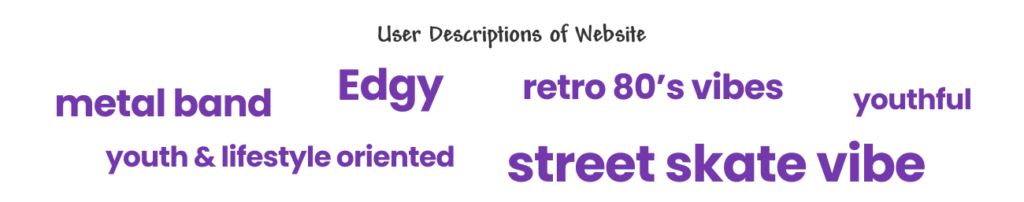
This was exactly what we were aiming for, so we viewed our branding as a success.
Homepage Helmet Interaction
We also tested users to see how likely they would be to interact with the purple plus signs on the homepage and click to learn more about the helmet. 94% of mobile users and 88% of desktop users said likely or very likely.

Again, we viewed this as a success and a fun way to have users engage with and learn about the helmet’s unique features.
Additional Homepage Access Point
When we asked users to navigate through the site to find the helmet safety page, on mobile this was no issue. Users easily used the hamburger menu to locate the page under EXPLORE.
However, on desktop we noticed that 50% of users instead returned to the safety plus sign on the homepage thinking that was the task. To create another access point to the content, we added a “learn more” link to the plus sign element that would link to the additional content on the site.

E-Commerce Experience and Color Picker
We asked users to shop for a helmet and add a pink one in a certain size (giving them a specific head size) to their cart. There was a 100% success rate for both mobile and desktop testing. Users were easily able to change colors, locate the sizing information, said they “loved it,” and that the experience was “intuitive.”

For mobile only we added the interactive color picker for engagement. Users said it was “very easy” to use and that they had “so much fun.” For those that did not use it, we moved the row of color options higher on the screen so users wouldn’t need to scroll back and forth as they changed colors.
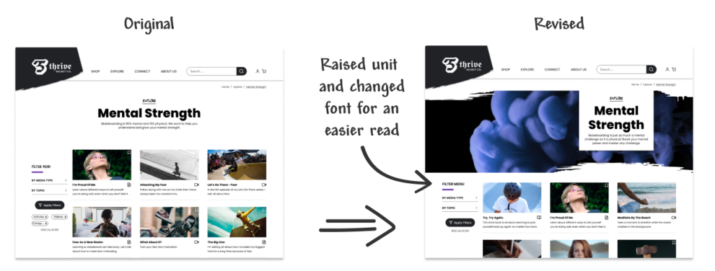
Filtering Content
When we asked users to click on a specific article and use the filter feature to locate it, we learned that users could easily use the navigation menu to access the mental strength channel.

For Mobile: Users had no trouble using the filters within the mental strength section to locate a specific article.
For Desktop: Users seemed to have a harder time finding the filter menu. To rectify this we:
- Raised the menu so it’s even with the first row photos and is the first thing users see when reading left to right
- Changed the typeface of “Filter Menu” to one that’s larger and easier to read.
THE RESULTS
Overall, our user testing went very well. We had the following takeaways:
- Our information architecture structure is effective. The information architecture and organization of our top level navigation is easy and intuitive. Users were asked to utilize it multiple times and didn’t get lost.
- Our branding and visual aesthetic is right on target. Users feel the site is fun and reflects the intended audience. We wanted to make sure the site reflected individuality and movement/excitement of skateboarding while still being clean and easy to use. We got a lot of feedback telling us testers liked the “vibe” and energy of the site.
- Shopping for a helmet is fun and easy. There were no significant misclicks while shopping for a helmet. Since this was an e-commerce website first, we wanted to make sure shopping was an intuitive and fun task. Users easily found the color choices, used the sizing chart to find the right size, and added the helmet to the cart with ease.
Next Steps
- Conduct further research and build out the community channel. We knew this would be an involved section of the site and require a lot of testing, so we had to hold off on this section given the limited timeframe.
- Continue building out the explore channel. There’s a lot of content within this channel, but we think we have a good foundation for how it can be set up consistently.
- Complete the e-commerce flow. The shopping cart and checkout process still need to be designed to complete the flow for users.
- Create additional elements such as: log in screen, profile, reward system, and a way to invite a friend.
Final Prototypes
HI-FI PROTOTYPES
Want to look around?
Below are links to the final interactive high-fidelity prototypes we designed for responsive desktop and mobile versions.