
Sign & Send for Hallmark
Improved the experience of the online feature to increase usage and product sales.
TEAM
4 UX Designers
MY ROLE
• Project Leader (organized and maintained schedule of deliverables)
• Visual Design Lead (Interaction and UI design)
The Challenge
OVERVIEW
How can Hallmark, the oldest and largest manufacturer of greeting cards in the country, increase customer use and purchases.
Initially this seemed like a big challenge, even somewhat vague. Where do we begin? We broke it down into 2 sections: the first being to increase customer use of its features, and the second, finding a way to increase purchases.
We decided we first needed to understand the customer and gain some general background information on their use of hallmark.com and purchasing behaviors regarding greeting cards and gifts, since hallmark.com also heavily promotes gifts.
Research Discovery
THE RESEARCH
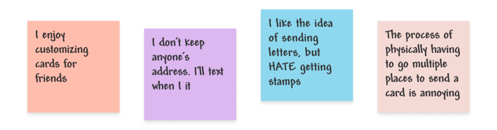
We first started by conducting user interviews and surveys with 5 candidates each to understand what user’s behaviors and pain points are around shopping and sending cards and gifts—all the things Hallmark is known for. We then used affinity mapping to discover that everyone we spoke to unanimously loved sending and receiving paper cards (vs e-cards) along with some other points of interest. We focused on these key takeaways.

THE PROBLEM
With this information, we were able to define the customers’ problem:
Users of hallmark.com long to stay connected and celebrate loved ones’ important milestones, but find the process of mailing cards time-consuming and frustrating. They need an easy way to personalize cards, find gifts, and mail them.
ADDITIONAL RESEARCH
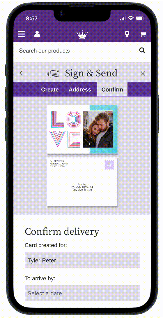
We also took an inventory of hallmark.com and its different features and noticed one called Sign & Send that already solves a lot of the pain points our interviewees mentioned. The feature was launched in 2021 and allows users to upload personal photos and messages to cards. It also stamps and mails them for customers too.
We conducted additional research around this product specifically and finally uncovered the main business problem: awareness. NOT ONE PERSON we spoke to was aware of this online feature.
We also discovered there were a few smaller usability issues within the feature that we could address to improve its functionality and flow for customers.
Lastly, to address the second part of the challenge—to generate more product sales—we decided to integrate an add-a gift component to the feature, so users could easily add an additional purchase to their cart rather than creating a completely new user journey on the site to buy a gift.
ZEROING IN ON THE SOLUTION
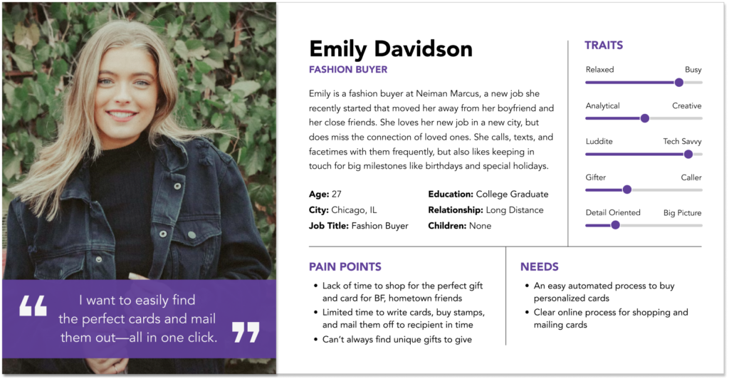
We next developed a customer persona based on our research, which helped us focus on finding solutions for her needs.
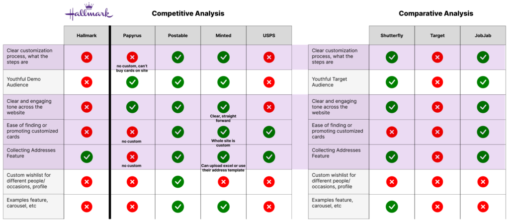
We also conducted competitive and comparative analysis of 7 companies to better understand the card market, the features offered, the process of personalizing and buying on each, the language used, and how we might be better able to make the customer’s life easier. We looked at 4 other popular online greeting card sources and 3 comparative companies known for customization or that users mentioned as being a top source for them to buy cards.
With this additional information, we were able to zero in our solution:
- Leverage Hallmark’s existing Sign & Send feature, but improve overall awareness through clear, intentional placement on homepage
- Improve user experience with clear messaging (new tag line, titling, progress indicator), usability enhancements, and visual consistency
- Boost sales with a new add-a-gift tie-in at end of process
Design Exploration
HOMEPAGE AWARENESS
To improve the visibility of Sign & Send, we began with the homepage. The current homepage only mentioned Sign & Send in text form in the last item on the page. We knew we wanted something much more prominent and at the top of the page. We sketched and wireframed how best to promote the Sign & Send feature, ultimately creating a widget where users could select an occasion for a card and enter the date they want it delivered by. (Note, all designs and elements were carried across mobile and desktop versions using a responsive website design.)


To further promote the feature to users, we added a clear title along with an icon and tag line that states the steps involved and the reward achieved from using the feature—a card is mailed for free!

IMPROVED USER EXPERIENCE
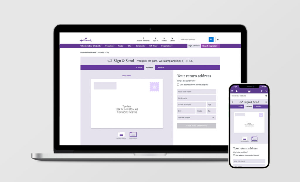
From having watched users interact with the current Sign & Send feature, certain areas of the process had been problematic and needed to simplified. To help with this, we added and updated the messaging throughout for better clarity and better navigation.

We also added new elements to streamline and save users time. Instead of them having to manually type in address fields like the current feature required, we added two additional options users can use to auto-populate the fields.
- Use their profile’s address book
- Generate a link request to send to a friend who would then be prompted to add their contact info to the user’s profile

ADD A GIFT ELEMENT
We also developed wireframes and task flows to better understand the journey users would take to complete various tasks. In an effort to combine the user’s card AND gift buying journeys into one journey and further increase product sales, this was our initial flow showing the path a user would take after completing their card to easily add a gift to purchase along with their card.
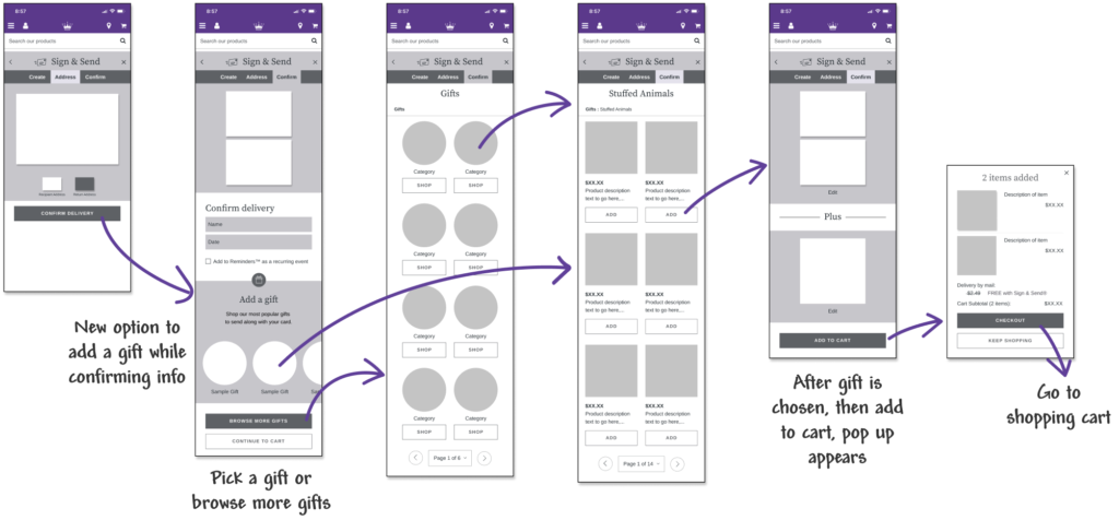
Add a gift in 1 click
Users can now quickly add a gift to go along with their card purchase rather than having to start a new search in another shopping journey.
User Testing and Results
USER TESTING AND FIXES
Relying on the results from 3 separate user testing surveys, we continued to hone and improve the feature based on what we learned. We corrected a misclick area that users thought was a button by changing the icon imagery. We also learned after testing the desktop version of the widget that it wasn’t as clear for users to interact with as it had appeared to be on mobile. We decided to remove the widget entirely and take a much simpler approach with very clear entry points.
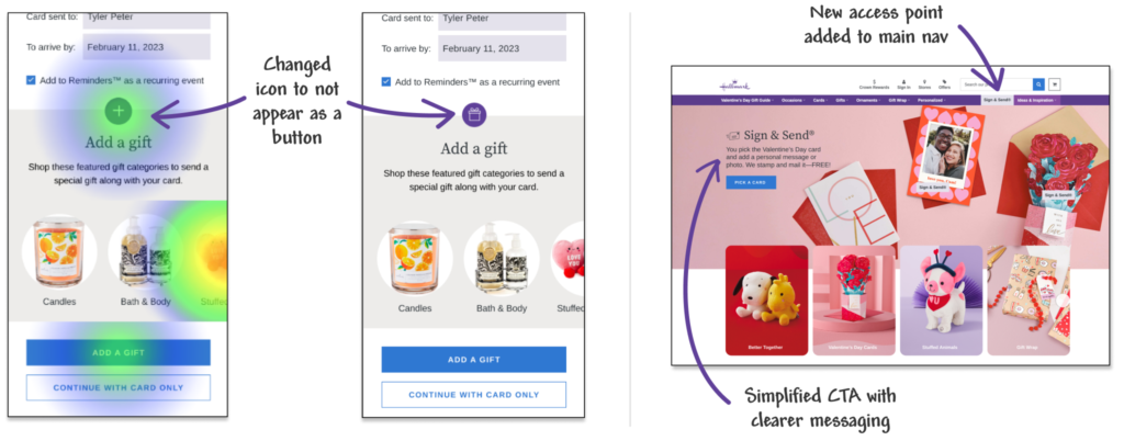
Revised homepage
Emily now has a much simpler way to access the Sign & Send feature with two access points on the homepage: one via a link in the primary navigation bar and the other directly through a large homepage banner with a clear call to action. After testing this new homepage, we were able to determine that users were better able to navigate the homepage access points and also had a more positive feeling about completing the task.

Revised add a gift
After initial user testing of the gift feature we also realized we could simplify the steps further. A new process confirmed users were able to successfully click on all of the intended interactions in the add-a-gift feature and were able to add to cart in 1 click now rather than progressing through several screens like we originally created and tested.

Revised messaging and added a tool tip
Finally, although users successfully completed the request address link task, several commented that they didn’t understand what they were doing or what it was. We updated the language and added a tool tip for better clarity.

THE RESULTS
In our last round of user testing, we learned that:
- 100% of users were now able to locate the Sign & Send feature via the homepage and access it throughout the site in the nav bar.
- Users are better able to navigate, understand, and interact with the Sign & Send feature overall and specifically with the address forms.
- Users can now easily add additional products to their carts, like a gift, to save them time and generate increased sales.
Insights and Next Steps
- I learned the value of testing smaller sections of the project more often, rather than waiting for everything to be finished. Our mobile homepage widget appeared to test well for users, but had we tested on desktop right away too, we would have realized it wasn’t the strongest solution sooner in the process.
- I would continue further testing on the Sign & Send portal as a whole, from end to end using contextual inquiries of our redesign, checking to see if there are other areas we could streamline for users or if there are other features we could add to make the product even stronger.
- Given that this is a concept project, in reality I’d be very interested to know if our changes did in fact generate increased traffic to this feature and increased product purchases of cards and gifts. I’d also be curious how many more sales the add-a-gift element generated, and would do various tests to see what gifts should be promoted there (overall best sellers, products currently trending, products based on customer’s past purchases, etc) to see which types of gifts customers respond to the most.
Final Prototypes
HI-FI PROTOTYPES
Want to look around?
Below are links to the final interactive high-fidelity prototypes we designed for responsive desktop and mobile versions.