Sherman's Maine Coast Book Shops Website Redesign
Enhanced the user shopping experience by improving product searchability and navigation.
TEAM
Solo
MY ROLE
UX Research, UX Design, UI Design, User Testing
The Challenge
OVERVIEW
For this concept project, I was asked to take an existing e-commerce site and redesign it to improve the shopping experience for customers and generate increased sales.
I decided to update the website for Sherman’s Maine Coast Book Shops, the oldest book store in Maine. It was founded in 1886 in Bar Harbor, ME, and now has 9 locations along the coast.
Research Discovery
THE RESEARCH
I began by conducting contextual inquiries of four users, watching them navigate, shop, search, and buy items on the current site, asking questions and seeing where their pain points were. Afterward, I asked them questions to better understand what they look for on a site when shopping online and how they prefer to search for items or navigate product information pages and the shopping cart.
I then created an affinity map to understand the key trends and challenges I needed to address in my redesign and boiled it down to three overarching things users need:
1. I want a clean, professional-looking place to shop. Being bombarded by information all at once didn’t create a pleasant shopping experience. Users felt the current site was a lot of competing visuals to sort out at once, cramped, and overall felt unprofessionally designed. They described it as:

2. I need flexibility in how I shop
- When shopping online, users want to find products easily and quickly.
- When looking for a specific book or author, users turn to the search bar first.
- When browsing for a new book, users need flexibility in how they shop (by author, by topic, by recommendations)
3. I need to be able to find the information I want quickly to save time
- 2/3 are influenced by recommendations when selecting a book, but all had trouble finding the sub navigation within the recommendations tab.
- When they find a book of interest, it’s crucial to read a description and synopsis before making a purchase.
- 100% like a wishlist or save-for-later feature, but found it hard to locate
- 100% want a simple, straightforward checkout process without repeated information or distractions
HEURISTIC EVALUATION
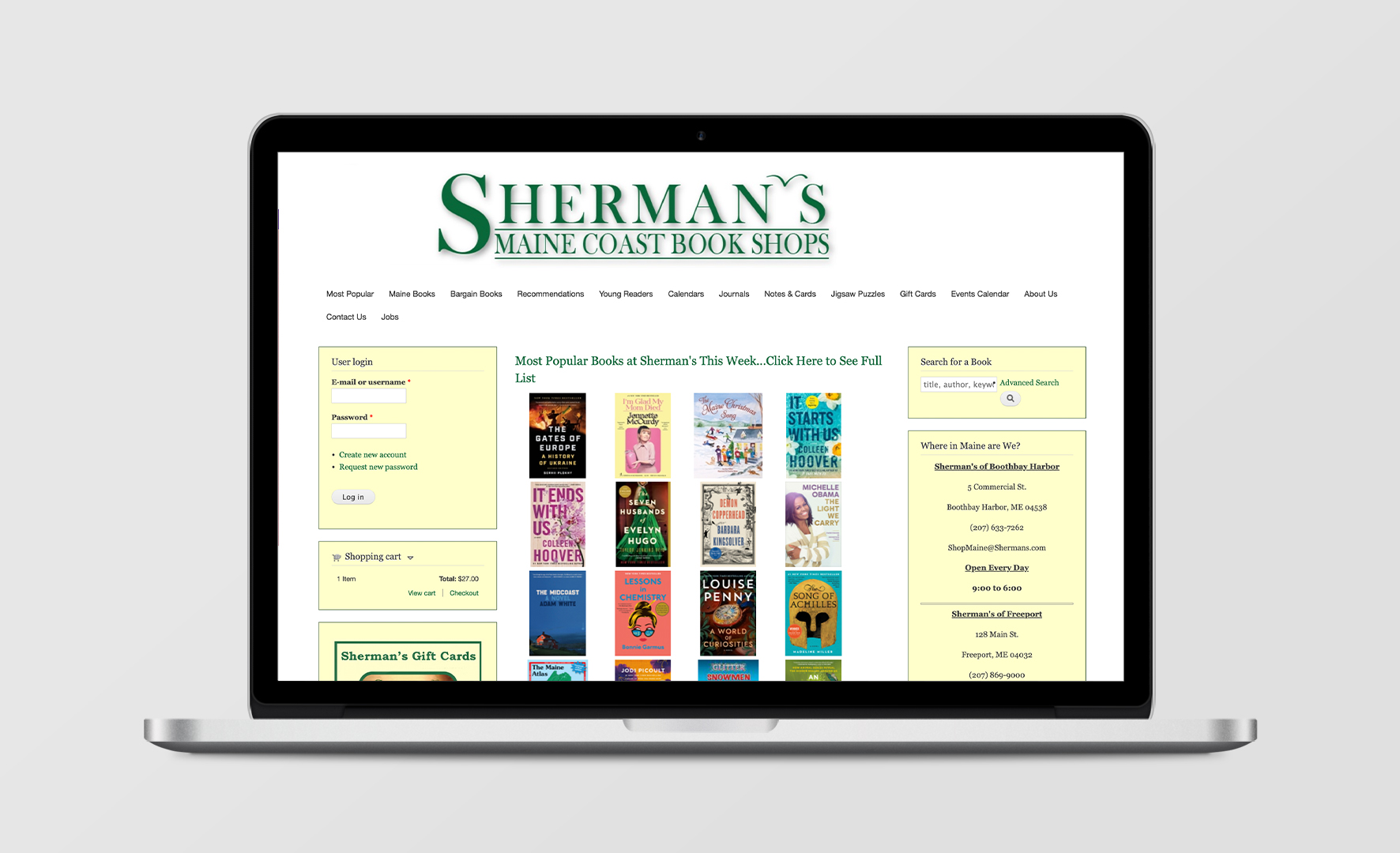
I also conducted a heuristic evaluation of the current site, focusing on select key pages like home, product, about, and checkout pages—pages that customers interacted with the most often. Below are a few examples of the things I noted, which provided me with new information to help me focus on specific key areas.
THE PROBLEM
This all helped me conclude that the problem is:
Users of shermans.com need a clear, yet flexible way to search and buy products because they are overloaded with content and a lack of information hierarchy on the current site and end up leaving dissatisfied with their experience.
ZEROING IN ON THE SOLUTION
I next developed the customer persona of Donna, a busy mom and avid reader looking for an easier, streamlined shopping experience.
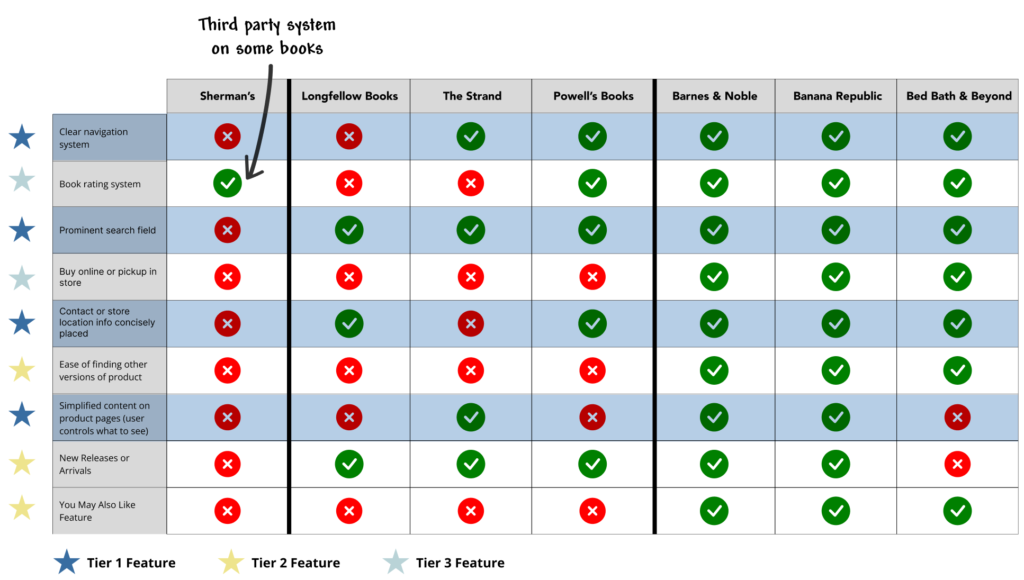
I also conducted competitive and comparative analysis on 6 companies: 3 “local” book stores and 3 larger retailers with numerous products needing clear categorization for easy searchability. I then divided up the items I researched into 3 tiers (or wishlist items) based on level of urgency and ease of implementation.
All of this research solidified the 3 areas I needed to focus on updating to create a strong user experience for shermans.com:
- Create a simpler, cleaner design
- Create a stronger navigation system
- Create better information hierarchy
Design Exploration
SKETCHING AND WIREFRAMING
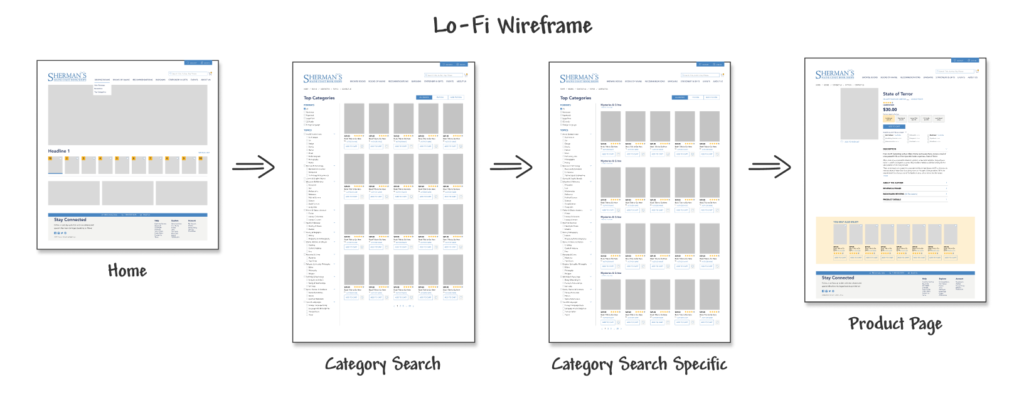
To update the design of the site, I worked on sketches and low-fidelity and high-fidelity wireframes, taking into account all the information I had gathered from my research.
SIMPLER, CLEANER DESIGN
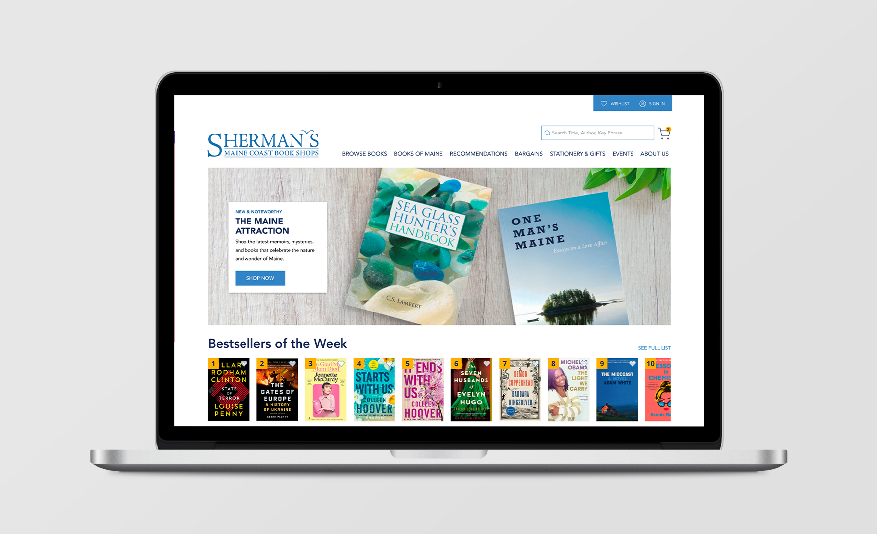
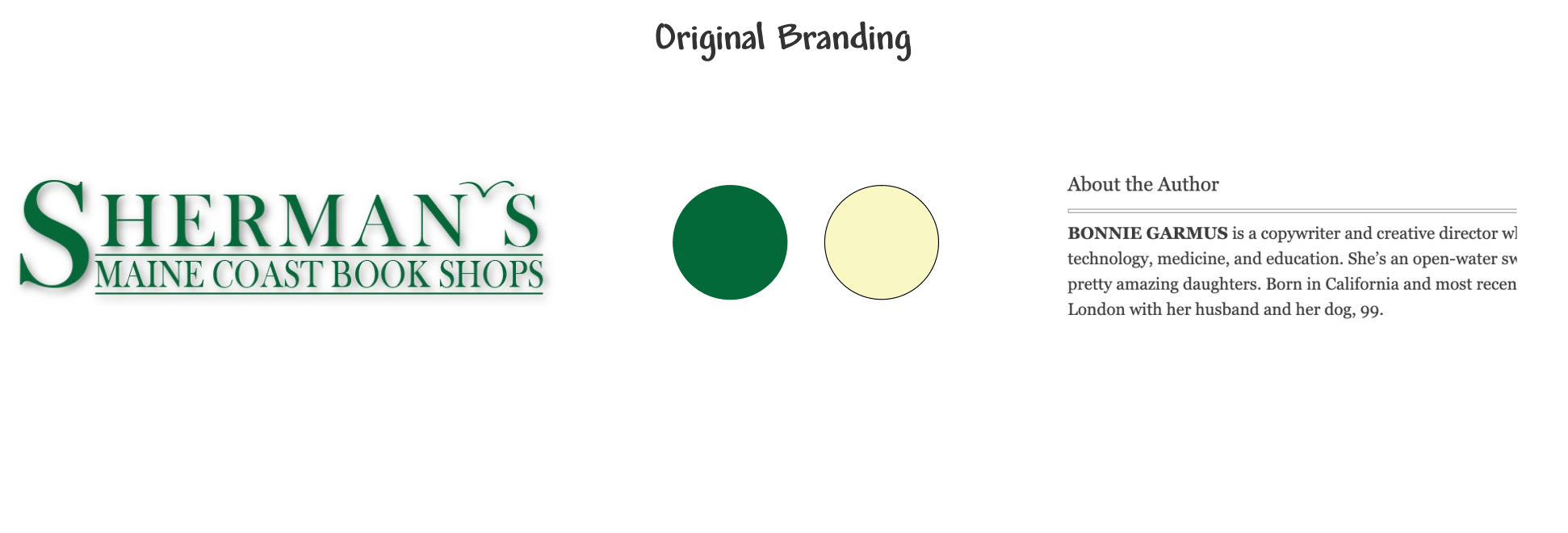
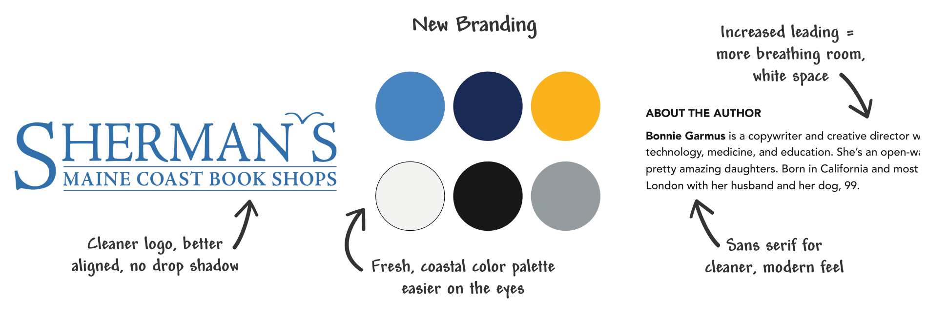
To address the need for a simpler, cleaner design, I developed new branding with an updated logo, fresh new coastal color palette, and new typography and spacing to better compete with the market and appeal to customer’s expectations.
STRONGER NAVIGATION SYSTEM
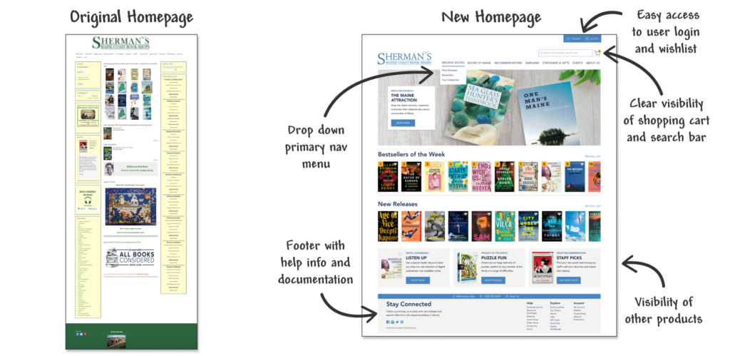
To simplify the large number of items in the main nav bar and create a stronger navigation system, I conducted open card sorting on 10 users and was able to narrow the items down from 14 to 7, creating sub categories and moving one item to the new footer element.
I then set out to tackle the long list of 52 book categories on the bottom of the homepage. To begin, I created categories based on my competitive analysis of other book stores and performed a closed card sorting on 7 users. Through this I was able to reduce the 52 categories down significantly, but there were about 15 topics users struggled to categorize consistently. With this information I recommended adding a few new categories and renaming a few others to be more encompassing and clearer.
New Footer for Help Documentation
To address the lack of help and documentation on the site, I made better use of the footer area to house that content, as well as the jobs link from the original primary navigation bar.
BETTER INFORMATION HIERARCHY
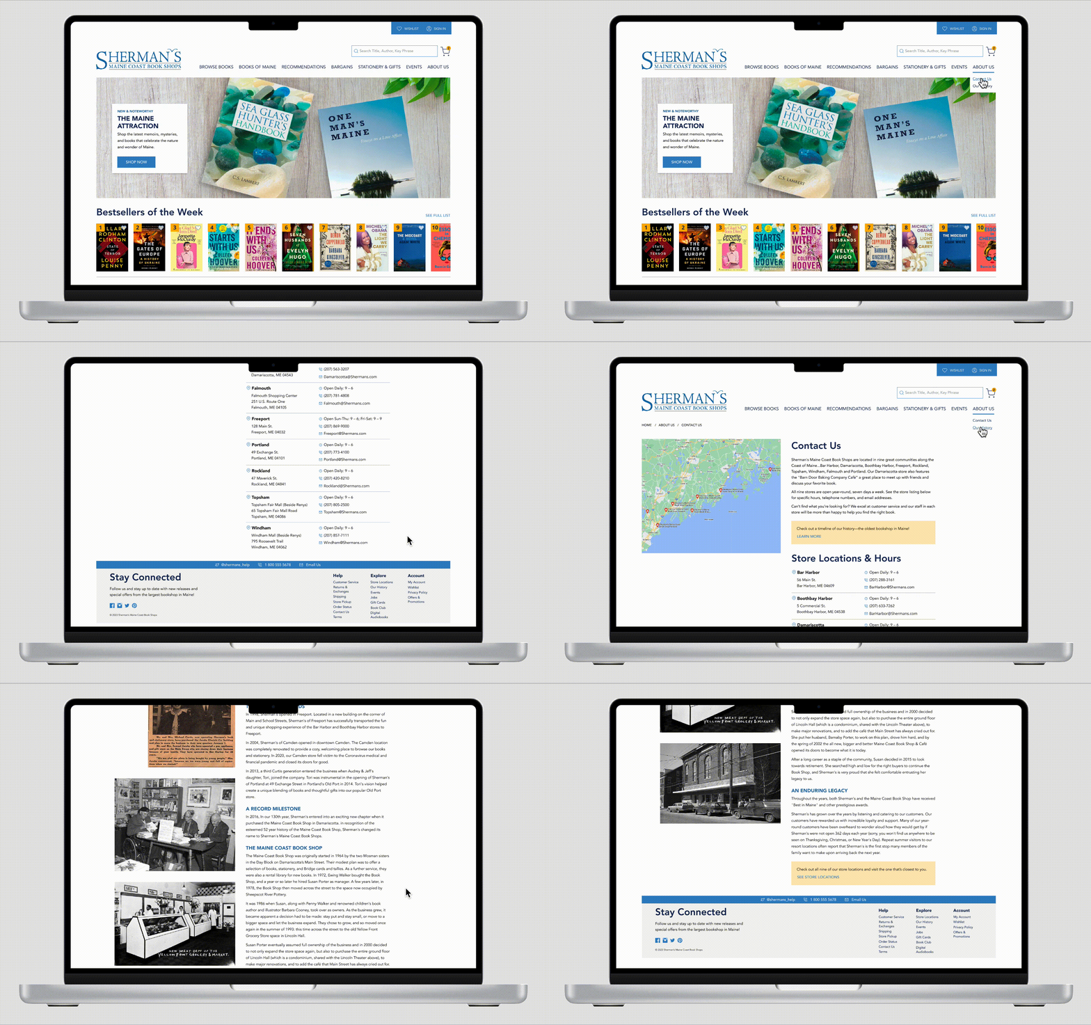
Better Organized Homepage Design
To tackle the information hierarchy challenges, I began resolving the homepage, keeping in mind that I wanted all of the information currently there to still have a place on the new site.
Improved Product Pages
I then refined the product pages, finding ways to condense and reorder information to remove the continuous scroll.
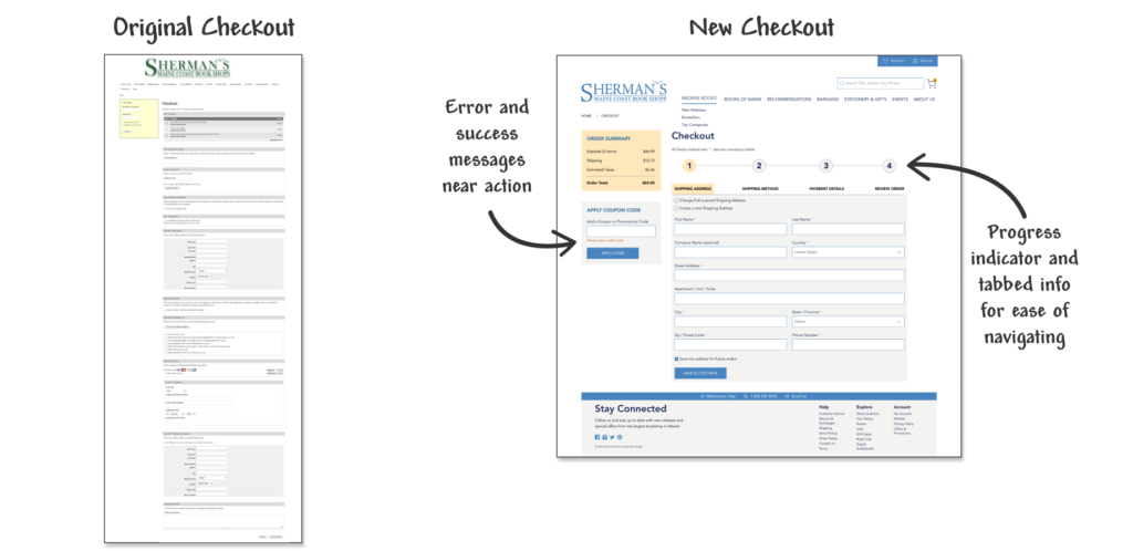
Easier Checkout Process
Lastly, I simplified the design of the checkout process by sectioning off the content with tab navigation and adding progress indicators so users would be less overwhelmed by a continuous scroll and know where they are in the process.
User Testing Results
THE RESULTS
As a result of user testing, I learned that:
- Users had a much better impression of the website and thereby the company.
- Users were better able to navigate the site—from the updated primary nav bar to secondary navigational systems within the site.
- Users could understand and locate information more easily than before.
USER TESTING AND FIXES
When asked to describe the new look of the site and company, users had a much more favorable impression of the company overall due to the new branding.
Users were also able to easily locate key elements such as store locations and hours, shopping cart, user login, and recommendations, despite the fact those items moved to improve the hierarchy of content and allow for larger product images on the homepage.
They were also able to easily identify the book details on the new product pages, and use new features like pickup-in-store and write-a-review.
Revised pickup-in-store feature
Through user testing I discover the intended link was hard for users to access resulting in a high misclick rate. The link wasn’t styled the same way as other links on the site, and was a smaller type size too. I corrected this, increasing the size and making the color blue to match other links.
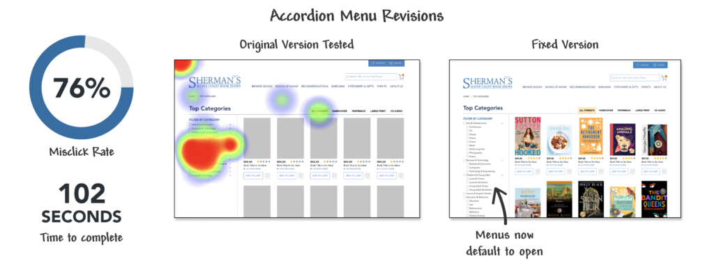
Category Filter
I also discovered through earlier testing that the filter category generated a very high misclick rate. I originally tested it with the menus closed thinking that would help users have less information to process at once, but then updated them to default to being open so customers can easily find their desired category faster and with fewer misclicks.
Insights and Next Steps
Locating specific categories of books is still a struggle for the users I tested, and one critical area I’d like to do more research on. While users did successfully interact with the filter feature, and I updated the design to have the accordion menus default to the open position to reduce misclicks and time spent, I’ve also learned through testing the topic categories list twice that everyone categorizes books VERY differently based on their past experience with a topic and their level of knowledge on the topic. There is no real categorization consistency across bookstore sites I’ve seen either, and I believe this is clearly an issue for all bookstores.For next steps, I would like to do more research testing to see:
- How the physical store categorizes books to see if that approach could be incorporated into the site
- What the top searches are that users are looking for on the site. Perhaps that’s a better list to pull from as users are clearly already searching for those topics
- If swapping to broader book genres would work better versus the current specific niche topics, many of which seem more scholarly and maybe aren’t general enough or appropriate for the online audience
Final Prototype
HI-FI PROTOTYPE
Take a look around. Below is the link to the final high-fidelity prototype I designed for desktop.
