SeniorBuddy Mobile App
Created a mobile app designed to safely foster social connection between seniors and non-seniors within urban neighborhoods.
TEAM
4 UX Designers
MY ROLE
• UX/UI Design, Design System, Branding
• Research, User Testing
The Challenge
OVERVIEW
This was a week-long hackathon project with the end goal of designing a mobile app or responsive website for a social cause or a nonprofit organization. The solution needed to support a realistic aspect of the cause that could be addressed using technology.
Research Discovery
THE RESEARCH
Our team discussed a few different ideas and quickly settled on the concept of helping elderly neighbors in our communities. We had seen this population suffer greatly from isolation during Covid (my own grandmother included), and after some initial research we discovered just how vulnerable this group really is.

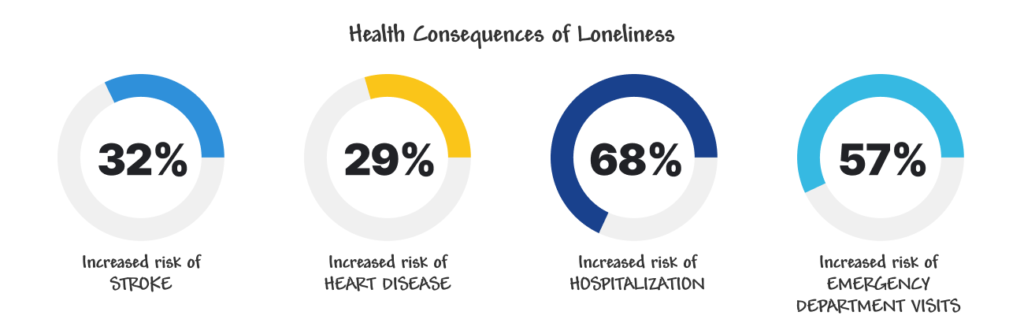
And the consequences of this loneliness and isolation can be very detrimental to mental and physical health.
We believed we could find a solution to this loneliness using technology by encouraging non-seniors (volunteers) to sign up and connect with seniors in their area for social visits, but were other companies already doing something similar?
In our additional research we discovered some companies did aspects of what we were thinking, but not the complete package. For instance:
- Some matched volunteers with a senior, but NOT for social connection (physical healthcare only).
- All we found were paid services, but we wanted ours to be free to further foster the sense of social community.
We didn’t see anything quite like our concept in existence, so we moved forward.
COMPARATIVE ANALYSIS
We then did an extensive comparative analysis, reviewing brands that had similar aspects to their product: like those that match volunteers for services and have a vetting process of some sort (Boys and Girls Club or for healthcare, cleaning, nannying reasons) plus those that match people based on purely social preferences (dating and meeting apps).
We initially noted the vetting process these brands used to explain information to users as well as their vetting process and preferences options and questionnaire. We also noted any ways these brands gamified their experiences for users.
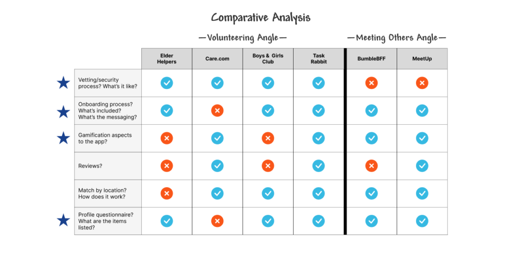
After an initial review, we went back and focused further on 3 key areas for comparison that would be important for users of our app:
- Security—since our app deals with seniors, a security screening is critical, but how do we onboard and message that clearly to users?
- Compatibility—how do users select their preferences, and what are they, to be matched?
- Tone—since our app is about developing social connections only (not medical, healthcare, or directly service related), how do we immediately relay that to users?
THE PERSONA
With all of this additional research and information gathered, we were able to develop a persona for our SeniorBuddy volunteer with the following desires:
- Wants to feel part of the community he’s recently moved to.
- Wants to help those (especially seniors) in his neighborhood.

Note: Due to the time constraints, we focused only on the perspective of the volunteer, but know that an app like this would require at least 2 personas.
THE PROBLEM
With all of the information we had, we defined our problem statement as: Users need a way to easily locate and connect with the elderly in their neighborhood to provide companionship in a safe and secure environment.
Design Exploration
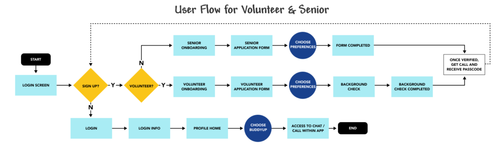
USER FLOW
We then began the design phase of the project. We mapped out a simple user flow from both the volunteer’s and senior’s perspectives.
LOGO, BRANDING, AND DESIGN SYSTEM
We also iterated on and developed a logo, branding, and design system of components and iconography that reflected the warm, casual tone we were looking for. We chose friendly, easy-to read typefaces and a vibrant, but warm color palette that would be appropriate for both the senior and the volunteer.

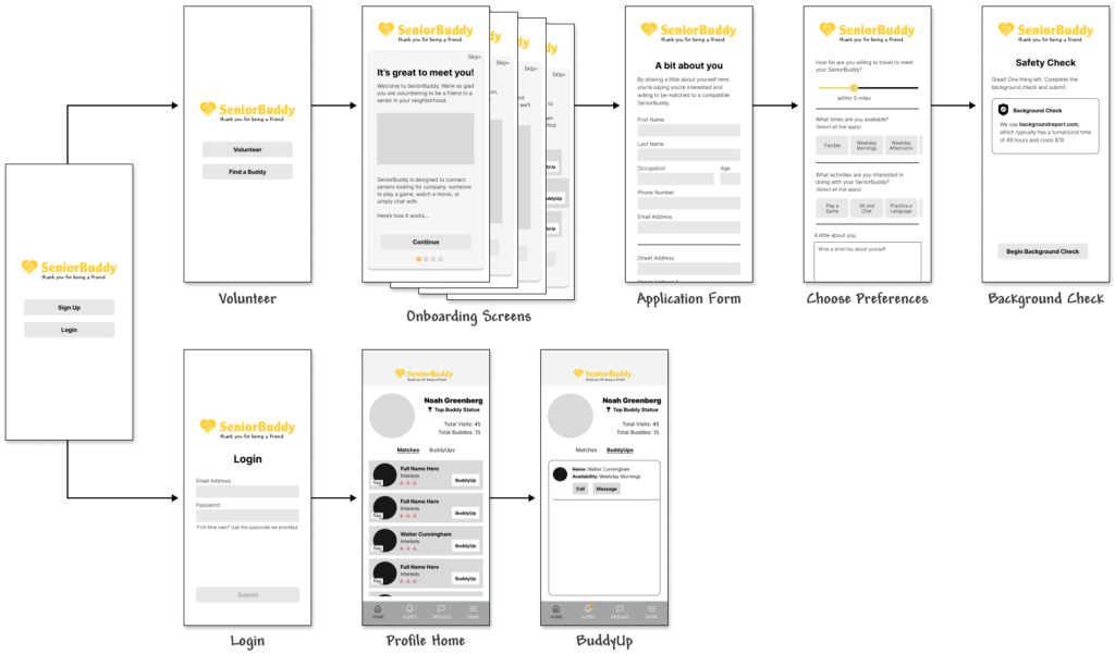
WIREFRAMES
We iterated on sketches and moved forward with wireframes and a low-fidelity prototype, which we testing with users before creating a high-fidelity version.
KEY FEATURES
Onboarding Volunteers
We knew the onboarding process would be very important for users as it would explain the purpose of the app as well as let users know early on about the security measures and safety check that would be required.
We also intentionally placed the security messaging up front to reduce user frustration, so volunteers wouldn’t get too far into the application process before they learned about the safety check.

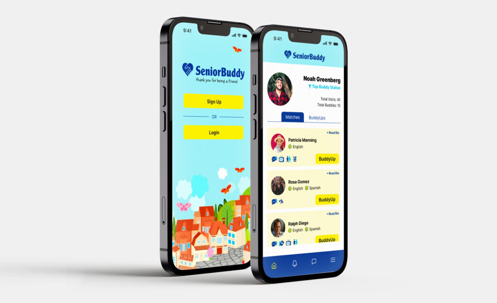
User Home Screen
Once users complete the safety check and are verified, they will gain access to their SeniorBuddy matches to review or read more in their bios. These matches are determined based on distance and preference each party selected.
Once they pick a senior to “Buddy Up,” they will then be able to chat or call within the app to maintain the privacy of both parties until an official meetup location is determined.
User Testing and Results
USER TESTING AND FIXES
We conducted user testing on 10 users of our low-fidelity wireframe. Using an agile workflow and making quick iterations based on user testing, we were able to adjust the project’s direction and quickly implement changes into our high-fidelity prototype.
Safety Messaging
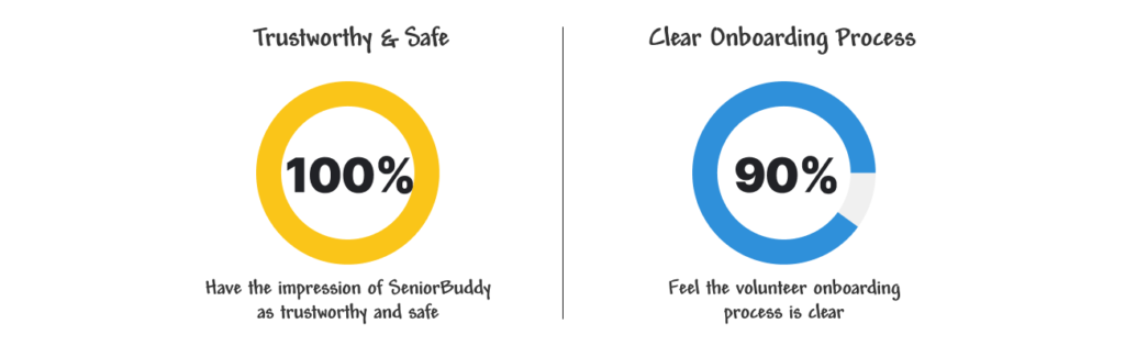
In user testing or low-fidelity wireframes, we learned that users DID feel our app was trustworthy and safe. This was something we tried very hard to convey, so we viewed this as a success.
Onboarding Process and User Flow
In our testing, users also told us the flow, onboarding process, and navigation was easy to use. Again, we viewed our work on this area as a sucess.
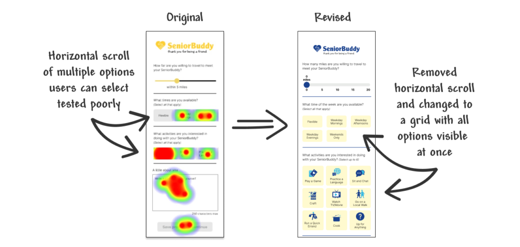
Selection of Preferences
One issue we did uncover had to do with a horizontal scroll feature in the part of the application where users select their preference. We initially used a horizontal scroll to present the volunteer’s preferences to reduce vertical space on the screen, but through user testing we discovered it wasn’t easy for them to interact with. They instead wanted to see ALL options at once before selecting any preferences, and the horizontal scroll wasn’t as intuitive as we had thought. We iterated on this issue and found a new solution, which we incorporated into the final prototype.
THE RESULTS
Through our user testing, we learned the following:
- 100% of users believe the safety messaging is clear and easy to understand
- Users feel the onboarding process and flow is easy to follow
- Users want to see all of their options when asked to make preferences
Insights and Next Steps
- Perform another round of user testing on the high-fidelity prototype to make sure our changes to the preferences selection improved user engagement. We’d also test and continue to refine for optimal usability and flow.
- Build out the senior perspective and flow. Given our limited time we focused on the volunteer, but know the senior’s perspective is just as critical.
- Further build out app features and navigation and explore ways of adding subtle (and appropriate) gamification interactions and elements like rewards based on engagement.
Final Prototype
HI-FI PROTOTYPE
Want to look around?
Below is a link to the final interactive high-fidelity app prototype.